Ever tried to explain a messy raid mechanic in chat, watched half the party misunderstand it, and then ate a wipe that felt totally avoidable? I’ve been there more times than I’d like to admit. Patch 7.4 adds the Strategy Board to Final Fantasy XIV, and it finally gives us an in‑game way to show positions, spreads, towers, and bait spots without tabbing out. Stick with me and I’ll show you exactly how I build clear boards fast, share them cleanly, and make them “PF‑proof” so your group stops guessing and starts pulling.
Where to Find the Strategy Board (and What It’s For)
The Strategy Board is an in‑game “whiteboard” for raid planning. You use it to place player icons, markers, and AoE shapes on a field. Then your party can look at the same picture and stop arguing about what “left” means.
Patch 7.4 launches the feature. You don’t need a quest unlock for it. You just open it and start drawing.
How to open the Strategy Board
You have two easy options:
- Open the main menu, go to Party, then choose Strategy Board
- Type /strategyboard in chat
I also put the Strategy Board on my hotbar. It saves time when PF fills and everyone wants a plan right now.
Fast access options (what I recommend)
| Access method | How it feels in real raids | My take |
|---|---|---|
| Party menu → Strategy Board | Reliable, but slower | Good when you’re learning it |
| /strategyboard | Fast and clean | Best if you like commands |
| Hotbar button | One click, always ready | My favorite for PF leading |
| Command Panel shortcut | Keeps UI tidy | Nice if you hate clutter |
Why Raiders Keep Coming Back to This Tool
Most groups already use diagrams. The problem is the usual flow feels annoying:
- Someone posts a screenshot
- Someone else can’t open it
- A console player gets stuck
- The party argues anyway
The Strategy Board fixes that by keeping the whole plan inside FFXIV. You drag and drop icons. You show the party a layout. You adjust it live when someone says, “Wait, where do I go?”
Another thing I like: a picture works across languages. A clean spread pattern does not care if someone plays in EN, JP, or DE. Everyone sees the same spot.
PF reactions also tell you a lot. When I share a solid board before a pull, the mood changes. People stop panicking and start focusing.
Your First Strategy Board: Preset, Blank, or Share Code
When you open the Strategy Board for the first time, you’ll see a list area and an option to create something new. Hit New Strategy, and you’ll see three ways to start.
The three ways to start a board
| Start type | What you get | When I use it |
|---|---|---|
| Preset Strategy Board | A template with field, boss icon, party layout, and waymarks | Most of the time |
| Blank Strategy Board | Empty canvas | When I want full control |
| Share Code Strategy Board | Loads a board from a code | When a friend sends a strat |
Preset boards save a ton of time. Blank boards feel better when you want something very clean. Share codes help when you join a group that already has a plan and you just want the same diagram.
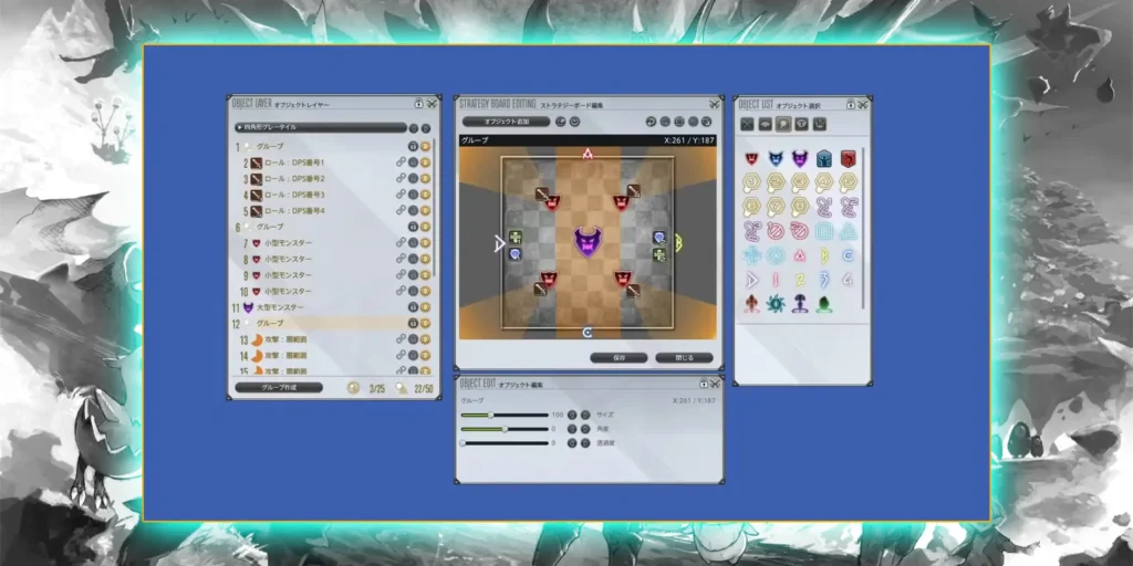
Strategy Board Editor Basics (So You Don’t Fight the UI)
The editor feels like simple image editing software. You get:
- A main board area (your canvas)
- A toolbox with icons, shapes, and markers
- Layer control so icons don’t hide under AoEs
It takes a few tries to feel smooth. After that, it clicks.
What I actually place on boards
You can build almost everything you need with a small set of parts:
- Player icons (roles or jobs)
- Boss icon in the center
- Waymarks (A/B/C/1/2/etc.)
- AoE shapes (circle, cone, donut, line)
- Arrows and lines to show movement
- Short text labels for the last 10%
I keep text short on purpose. PF reads pictures faster than sentences.
Editor tools I use the most
| Tool | What it solves | Small tip |
|---|---|---|
| Player icons | “Who goes where?” | Keep role labels consistent |
| AoE shapes | “What space is dangerous?” | Don’t overdraw; one shape per idea |
| Waymarks | “Which side are we using?” | Place them like your macro does |
| Arrows/lines | “Where do we run next?” | Use one arrow, not five |
| Layers | “Why did my icon disappear?” | Put players above AoEs |
| Text boxes | “One last detail” | Use tiny labels, not paragraphs |
Common Raid Layouts: How I Draw Spreads, Light Parties, Towers, and Baits
Most raid diagrams repeat the same building blocks. You don’t need fancy art. You just need the plan to read fast.
Spreads: everyone gets a personal spot
A spread board needs clean spacing. Put the boss in the middle. Place eight player icons around the arena. Leave obvious gaps.
I like spreads that look symmetric. It helps people remember them mid‑fight.
Quick spread checklist
- Boss icon centered
- Supports on cardinals
- DPS on intercardinals
- No overlapping icons
Light parties: two groups of four
Light party mechanics love simple clustering. Put one group on north and the other on south. You can also do west/east if your group prefers that flow.
I usually avoid long labels here. The grouping alone tells the story.
Partner stacks: pairs that share a spot
Partner mechanics fail when pairs feel unclear. I physically place the two icons close together. Then I add a stack marker icon on the same point.
You can also show two different stack points if the mechanic splits pairs.
Towers: who soaks what
Towers need two things:
- Clear tower spots
- Clear assignments
I represent towers with circle AoE markers. Then I place role icons on each circle. If the soak order matters, I add a tiny “1” and “2” text label.
Bait positions: where you drag danger
Bait mechanics often need movement. I put an arrow toward the bait corner. Then I place the bait player icon at the end of the arrow.
One arrow usually beats a full route map. People don’t need a GPS. They need a destination.
Mechanic Cheat Sheet: What to Place on the Board
Here’s the same info in a tight format. I keep this mental table in my head while I build.
| Mechanic | How I show it | Preset or tools that help |
|---|---|---|
| Spreads | Eight icons evenly spaced | Full Party preset Composition 1 |
| Light parties | Two clusters of four | Composition 4 (N/S) or Composition 5 (W/E) |
| Partner stacks | Two icons paired + stack marker | Composition 2 or 3 + stack marker |
| Towers | Circle markers + role icons on each | AoE circles + short labels |
| Baits | Arrow to bait point + bait icon | Arrow symbols + line AoE if needed |
Presets: How I Get 80% Done in One Click
Presets matter because they remove the boring setup work. You pick a few options and the board spawns with a clean layout.
When you create a preset board, the game asks for four things:
- Field type
- Enemy (boss) icon
- Party positioning
- Waymarks
Field type: pick what helps you think
Field options include checkered grids (circle or square) and plain backgrounds (circle or square). The field doesn’t change mechanics. It changes how easy it feels to align positions.
I pick a checkered grid when I want symmetry. I pick plain when I want a clean look.
| Field type | Best for | Why it helps |
|---|---|---|
| Circular checkered | Spread patterns, symmetry | Grid makes spacing easier |
| Square checkered | Square arenas | Corners feel obvious |
| Circular plain | Clean PF boards | Less visual noise |
| Square plain | Minimal diagrams | Keeps focus on icons |
Enemy icon: size matters for readability
Enemy icons come in Large, Medium, or Small. I use Large most of the time because it gives a strong “center” reference.
Party positioning: the real preset value
These are the preset “Compositions” you’ll see. Each one matches a common raid layout.
Party positioning cheat sheet
| Preset composition | What it sets up | When I pick it |
|---|---|---|
| Composition 1 | Supports on cardinals, DPS on intercardinals | Spreads, default starting spots |
| Composition 2 | Partner pairing focus (support rotation) | Partner stacks with support emphasis |
| Composition 3 | Partner pairing focus (DPS rotation) | Partner stacks with DPS emphasis |
| Composition 4 | Light parties split North/South | Most “2 groups” mechanics |
| Composition 5 | Light parties split West/East | When the strat uses left/right lanes |
Waymarks: use them only if they matter
Waymarks drop letters/numbers like A/B/C/1 and more. You can pick patterns like “Spread” or “Close,” and the pattern can start on different diagonals.
If your plan references markers, include them. If your plan doesn’t, skip them. Clean boards win.
Waymark pattern quick picks
| Waymark style | What it looks like | When it works |
|---|---|---|
| Spread | Markers spaced out | Strats that call “go to A” |
| Close | Markers near center | Stack‑heavy plans |
| None | No markers | When icons tell the whole story |
Sharing Strategy Boards: Static vs Party Finder
Building a board only helps if your team sees it. Strategy Board sharing makes that part simple.
You have three main sharing patterns:
- Share with party (in‑game)
- Real‑time collaboration
- Share codes
Share with Party: fastest for PF
If you’re in a party, you can share a board directly. Everyone gets a notification. Then they can open it from their shared list.
I do this at the start of PF. I also say one simple line in chat: “Shared board. Open it in Party → Strategy Board.”
One limit matters here: only up to 20 boards can sit in someone’s shared list. If they want to keep it, they should save it.
Real‑time collaboration: best for adjustments
Real‑time sharing lets your party watch edits as you move icons around. It feels like you’re talking and drawing at the same time.
I use this during prog when someone asks, “What if we swap these two spots?” I drag the icons and everyone sees the change instantly.
Share codes: best outside the party
Share codes let you turn a board into a code string. Your friends can paste it and load the exact same board.
That works great across data centers, or when you aren’t grouped. Codes can also get long, so I avoid posting them in cramped chat situations.
Sharing methods comparison
| Method | Best for | What can go wrong | My fix |
|---|---|---|---|
| Share with Party | PF and quick pulls | People don’t know where to find it | One clear chat line |
| Real‑time sharing | Prog adjustments | Too much editing slows pulls | Edit between pulls only |
| Share code | Static planning | Code length gets annoying | Keep boards simple |
Workflow I Use With My Static (Repeatable and Low Drama)
Statics love consistency. I follow the same loop every week.
- I draft a board when we learn the mechanic.
- I share the code in our group chat.
- We review it before raid time.
- I share the board in‑game when we zone in.
- We tweak it after wipes.
Folders help a lot here. I make a folder for each raid tier and keep boards organized by phase. I also keep names short and searchable.
Naming scheme that stays readable
| What you’re drawing | Good board name | Why it works |
|---|---|---|
| Phase start positions | “Arcadion P1 Opener” | Clear and short |
| Tower assignments | “Arcadion P1 Towers” | Tells you the goal |
| Partner stack layout | “Arcadion P2 Pairs” | One word = one idea |
| Movement pattern | “Arcadion P2 Dodge” | Easy to scan |
Workflow I Use in Party Finder (Fast and Polite)
PF needs speed. The group won’t wait while you “perfect” the art.
Here’s what I do:
- I open the Strategy Board as the last slots fill.
- I load a preset that matches the mechanic (usually Composition 4).
- I add only what the party must know to survive.
- I share the board with party.
- I ask one question: “All good? Any questions?”
That last line matters. People accept a plan more easily when you invite questions.
PF leader mini workflow
| Step | What you do | What the party gets |
|---|---|---|
| Build fast | Start from a preset | Immediate structure |
| Add only essentials | Towers, spreads, baits | Less confusion |
| Share | Push to party | Everyone sees the same plan |
| Confirm | One short check | Fewer “I didn’t know” wipes |
How to Make “PF‑Proof” Strategy Boards
PF‑proof means: someone who never raided with you can still follow the diagram.
I focus on six rules.
1) Keep text short
PF doesn’t read essays mid‑pull. A board should communicate with icons first. Text should only support the picture.
Good text looks like: “G1,” “G2,” “Bait,” “Stack,” “Dodge.”
Bad text looks like: a paragraph.
2) Use standard labels
Stick to labels people already know:
- Party 1 / Party 2
- Light Party A / B
- M1/M2/R1/R2 (or D1‑D4)
Pick one style and commit. Don’t mix them.
3) Keep the board clean
A clean board teaches faster. A messy board makes players ignore it.
I aim for 2–3 key elements per mechanic:
- Where to stand
- What to soak
- Where to run
4) Use contrast and simple highlights
Colored shapes help. Overdoing color hurts.
I like one “danger” color and one “safe” color. That’s enough. If I add text, I give it a dark background so it stays readable.
5) Think like a new player
Pretend you don’t know the fight. Would the board still make sense? If not, adjust it.
I sometimes show my board to a friend outside the raid. Their confusion points show my weak spots fast.
6) Avoid spoilers and extra noise
Keep one board focused on one idea. If the fight needs multiple phases, I split boards by phase.
Generic labels work fine too. “Big AoE #1” beats a mechanic name in a learning party.
PF‑proof checklist
| Check | If you can say “yes,” you’re good |
|---|---|
| Can someone understand it in 10 seconds? | The board reads fast |
| Does it use one label style? | No mixed naming |
| Does it avoid paragraphs? | Icons do the job |
| Do player icons sit above AoEs? | Layering stays clear |
| Does it show only what matters? | No clutter |
Keep vs cut (quick clutter audit)
| Keep | Cut |
|---|---|
| One arrow to the safe spot | Five arrows showing a full path |
| Towers + assigned roles | Extra circles “just in case” |
| Waymarks used by the strat | Waymarks that don’t matter |
| Short labels like “G1” | Long sentences |
| One clean spread layout | Multiple alternate layouts on one board |
Example: Building a Generic Arcadion Strategy Board (No Spoilers)
Arcadion: Heavyweight arrives in Patch 7.4. The fights get complex, so a simple visual plan helps a lot.
I’ll walk you through a generic board build. I won’t reference specific mechanics. I’ll just show layout logic you can reuse anywhere.
Step 1: Pick the scenario
I start with a basic goal:
- Split into two light parties
- Soak towers
- Dodge line attacks
This combo shows up everywhere in some form. The exact details don’t matter for the method.
Step 2: Create a preset board
I click New Strategy → Preset Strategy Board.
Then I choose:
- A circular field (checkered if I want spacing help)
- Large enemy icon in center
- Composition 4 (light parties N/S)
- 4 waymarks spread (only if the strat uses markers)
That gets me a clean base in seconds.
Step 3: Adjust the groups
If the plan wants towers on west/east, I move the groups.
If the plan wants north/south, I keep the default.
I also delete any marker I won’t use. Less visual noise helps PF.
Step 4: Add towers and line danger zones
I place two circle AoE markers where towers will be.
Then I place a line AoE indicator through the arena to show danger.
After that, I put the right role icons on each tower circle.
Step 5: Add minimal movement arrows
I draw a small arrow from each group toward the safe side.
That arrow tells the whole story: “Soak, then move.”
Step 6: Review and simplify
I zoom out mentally and ask:
- Do the icons overlap?
- Does the board show one plan or three?
- Does text add anything?
If text adds nothing, I remove it.
Step 7: Save and name it
I save the board and name it something short like:
- “Arcadion P1 Towers”
- “Arcadion P1 Split”
- “Arcadion P2 Pairs”
Step 8: Share it
In static: I share it in‑game and talk through it once.
In PF: I share it, then ask if everyone understands.
Example board layer order (so it stays readable)
| Layer priority | What I put there | Why it matters |
|---|---|---|
| Top | Player icons + short labels | You always need to see people |
| Middle | Towers + stack markers | Assignments stay visible |
| Bottom | AoE shapes, danger lines | Background context only |
Common Strategy Board Mistakes (And How I Fix Them)
I see the same problems again and again. The fixes stay simple.
Mistake 1: Too much text
People don’t read during raid. Long text blocks also hide the board.
Fix: cut text to single words. Let icons do the work.
Mistake 2: Mixed labels
One board uses D1‑D4. Another uses M1/R2. Someone gets lost.
Fix: pick one naming style for your group and stick to it.
Mistake 3: Too many shapes
Extra circles and arrows feel “helpful” until nobody can see their icon.
Fix: one shape per idea. If you need more, make a second board.
Mistake 4: Bad layering
AoE shapes cover player icons. The plan becomes unreadable.
Fix: move player icons above shapes. Keep danger zones underneath.
Mistake 5: Sharing too late
PF gets impatient. People pull while others still open the board.
Fix: share early, right after the party fills. Keep your speech short.
Mistake 6: Share codes that feel messy
Long codes don’t fit cleanly in chat sometimes. It becomes a headache.
Fix: keep boards simple. Use direct party share when you can.
Quick Pre‑Pull Routine for PF Leaders and Static Leads
This routine keeps pulls moving and reduces “Wait, where do I go?” moments.
My 60‑second routine
- Open Strategy Board.
- Load the right board or preset.
- Check labels match the party’s style.
- Share to party.
- Ask: “All good?”
That’s it. No lectures. No overexplaining.
Pre‑pull checklist
| Check | Goal |
|---|---|
| Board matches the strat | No “wrong plan” chaos |
| Labels stay consistent | Less hesitation |
| Board looks clean | Faster understanding |
| Sharing happens early | Fewer delays |
| One quick confirmation | Fewer surprise wipes |
Conclusion
The Strategy Board in Patch 7.4 gives us a simple way to explain raid plans inside FFXIV. You can build spreads, light parties, towers, and bait positions with clean icons and a few shapes. Presets help you set up the base fast, while sharing tools let you sync the plan with your static or Party Finder in seconds.
If you want one takeaway, take this: build boards that read fast. Keep text short. Keep labels consistent. Keep the layout clean. Do that, and you’ll spend less time arguing about positions and more time actually clearing.